


The first time I met Rue de Cunda was about ten years ago, which was near our Beijng Studio. I vaguely remembered that it was a small door whose material was not quite clear to me. During that time, Macau hotpot was extremely popular. However, Rue de Cunda with little fame was not conspicuous. The taste was delicious but the price was not expensive, and slowly we became the regular customers. A few years later, when we walked through the restaurant and found that it had merged the store beside it. Of course, we do not know what they have done in the last few years. Until one day, Frankie, the owner of Rue de Cunda, found us and commissioned us to help him design a new branch store, which was located in Beijing CBD.
Our roles changed from the restaurant's customers to the designers of Rue de Cunda. From then, we had acquired a deep understanding of the Rue de Cunda Street. Our congenital advantages are the experiences and cultures of restaurants' development. The name of this brand was derived from a Macau Street “Rua da Cunha”, where Frankie grew up. This name represents the solicitude for hometown of Macao. No matter how far he walked, the taste of hometown will be very familiar and stubborn in his mind. Like a kite flying in the sky, one side combines the place thousand miles away and the other side always connects the home of deep memory.
Maybe I can imagine the hardships that Frankie encountered when he started his business ten years ago. Rua da Cunha is keeping pursuing the original tastes of food whether in the past or at present. “Eating is the basis of Macau people.” Eating has been the most important thing of people. In nowadays, it is easy to have enough food, but it is hard to eat with high quality.
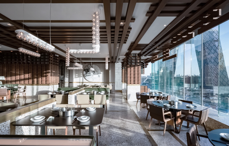
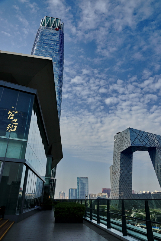
Rua da Cunda has achieved the best. Fresh seafood by air transportation, brilliant Australian beef and fresh vegetables from organic farms ensured the original taste of foods. The soup which has been boiled for more than eight hours makes it more perfect. When you drink the soup at the beginning, you will never regret this voyage. The Rua da Cunda restaurant seats the most prosperous place in Beijing CBD with the best landscape of East Third Ring. The french windows make you have a beautiful panoramic view of CCTV.
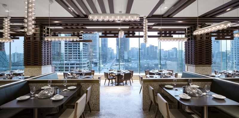
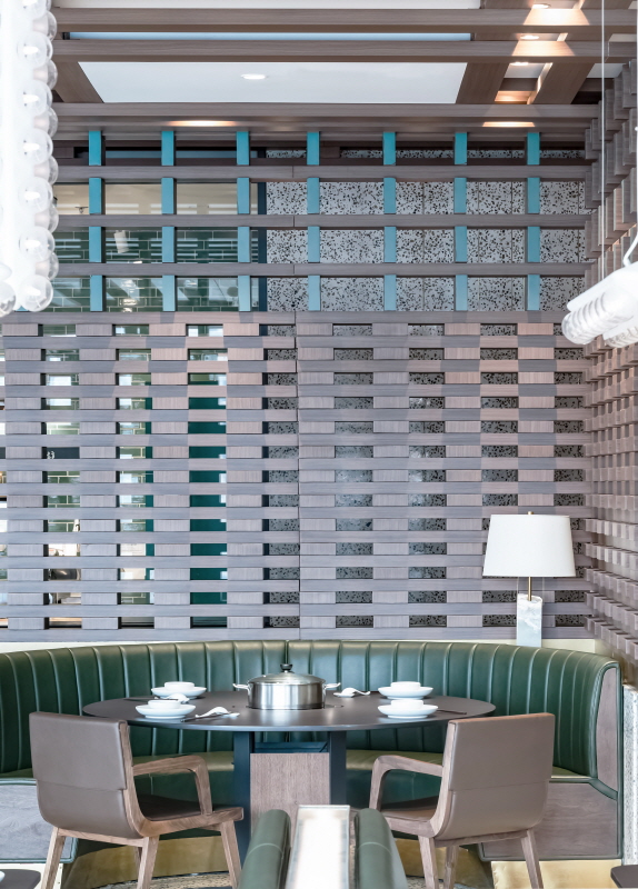
At the initial stage of our design, we determined to use glass curtain landscape area as the breakthrough point. By using the original subsidence space to create a Miniature Theater, from the lowest point (french windows) to highest point (interior space), which forms three levels, at the same time, each one could appreciate fine scenery. The rest space of this restaurant is more private, which are suitably used as compartments. Meanwhile, it can improve the efficiency of the whole space. We mainly used the logs, other natural materials and the most primitive methods to create a rich spatial effect.
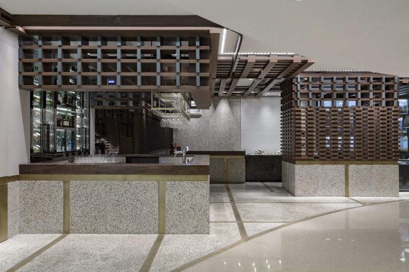
It is worth mentioning that the facade. The original red line is half curve, which will be bound to be planarization and cannot be combined with interior space. Since we changed the curve into a broken line, which makes plain facade variable and full of the sense of rhythm. At the same time, with the utilization of time and space conversion relationship, it virtually increases the restaurant display surface through extending the length of the facade. Of course, there were many difficulties in the process of construction, such as the difference between ground water grindstone and copper plate density, which made the ground black and insufficient flatness. Also, the size of the log was not consistent with the site size. And then there were the smallpox models that covered the fire sprinklers and so on. Sometimes, the problem is difficult to foresee, but it is also the charm of design. The emergencies can help us to gain the abilities on solving the problems and increasing our enthusiasm on design. Each project is a fresh task and each case is unique. We keep on learning and designing on the way forever.
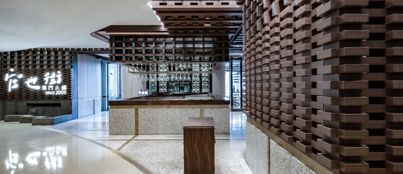
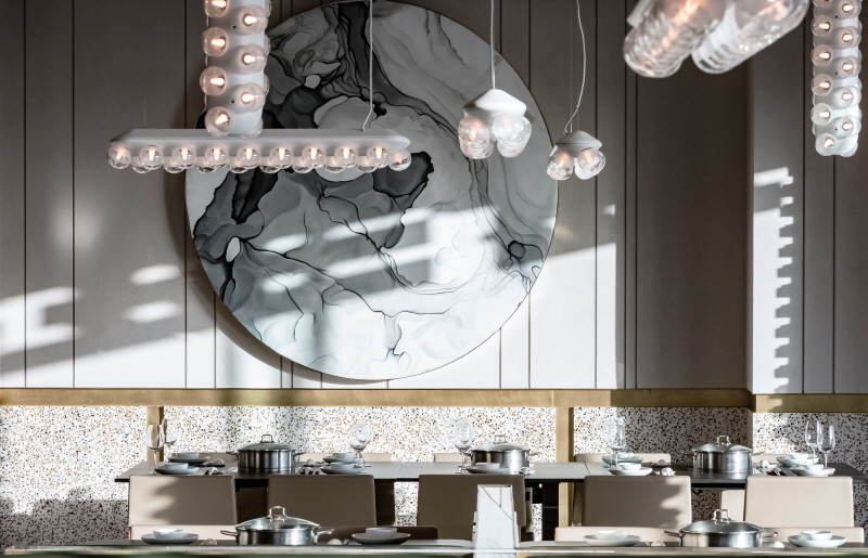
The identity design was derived from inheriting tradition and creating classic spirits. By using oriental jade green with classic bronze gold to present design consistency and extend the image of enjoyment of gathering together.
The typeface design is divided into two parts. The top part of the logo shows the steam evaporation when you open the pot lid. End of stoke is symbolized how the hotpot amaze your taste which is fresh and impressive.
The design concept comes from hotpot steam and turn it into symbols. By using layers together into a stack not only to present steam rises, but also enhance brand awareness and imagines.
0개의 댓글
댓글 정렬