


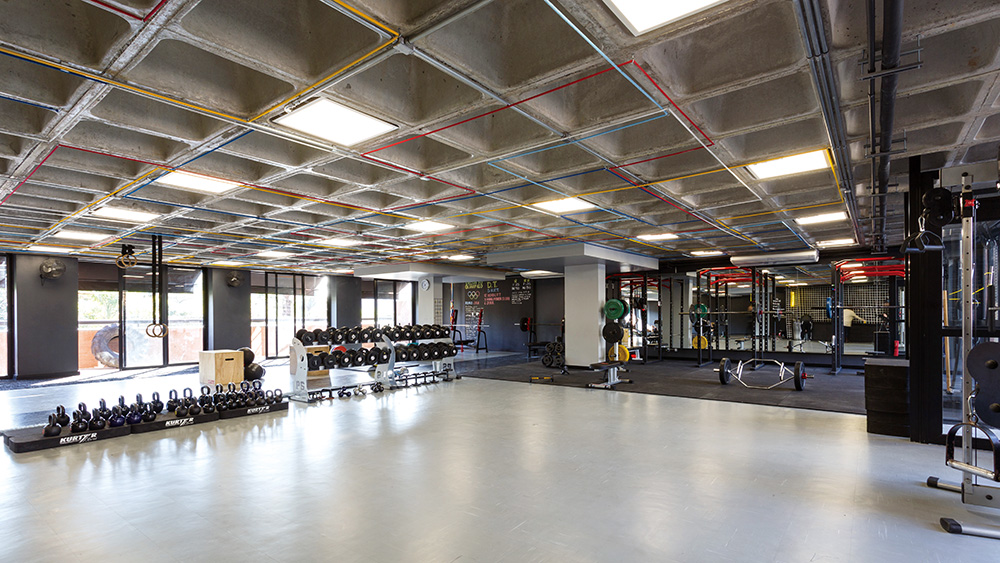
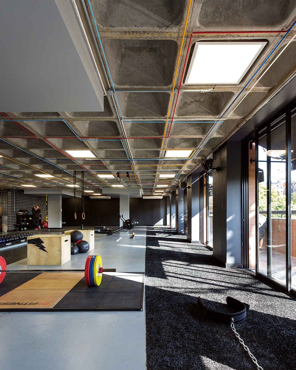
브라질 남부 지방 포르투알레그리(Porto Alegre)에 위치한 Estudio Pretto는 훈련 및 스포츠를 전문으로 하는 공간이다. 설계 및 디자인을 맡은 Arquitetura Nacional은 더욱 쾌적하고 유니크한 공간을 완성하기 위해 기존의 콘크리트 슬래브는 그대로 유지하고, 거기에 시각적 ∙ 기능적인 요소만을 더했다. 상업 공간의 한층 전체를 차지하고 있는 Estudio Pretto는 이용자와 트레이너의 지속적이고 원활한 커뮤니케이션이 필수였기에 시각적으로 자연스럽게 연결되고, 한눈에 공간을 파악하기 쉽도록 설계했다. 운동을 위한 메인 공간은 회색과 검은색 등 어두운 컬러를 베이스로 하며, 여기에 5가지 색상의 로프가 천장을 가로 지르며 뻗어 나가 활동적인 분위기를 띤다.
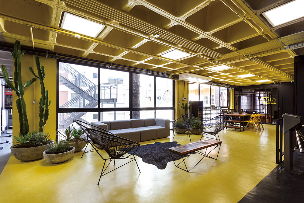
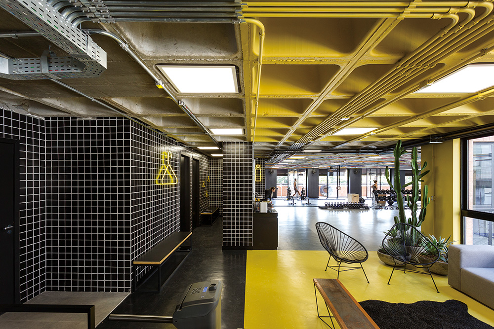
리셉션과 라운지 공간, 라커룸, 준비운동 및 훈련 공간 등 각 공간은 기능과 역할에 따라 구획이 이루어졌다. 구획의 기본 요소를 컬러로 삼아 라운지와 리셉션 구역은 벽과 천장, 바닥에 모두 화사한 노란색을 적용했다. 운동 중 쉬기도 하고, 서로 소통하면서 사람을 사귈 수도 있는 유연한 곳으로 기획해 가벼우면서도 밝은 느낌의 공간으로 연출했다. 또한, 포인트 컬러를 활용한 네온사인과 푸른 식물, 소파, 카펫 등 편안한 분위기를 고조시켜줄 아이템들을 함께 배치했다. 이외에도 공간을 상징하는 옷걸이, 물병, 간판 등 인포그래픽을 활용한 노란 네온사인을 적용해 공간의 아이덴티티를 확실히 함과 동시에 딱딱하고 차가운 운동 공간에 가벼운 재미 요소와 빈티지한 매력을 더했다.
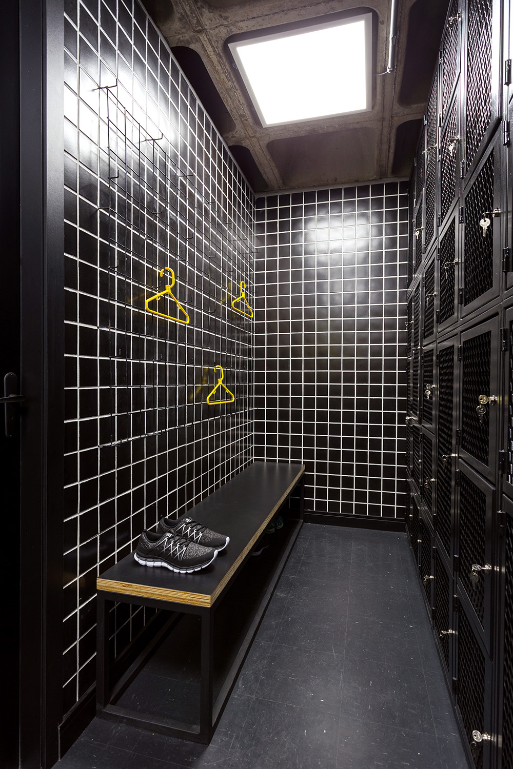
훈련 공간과 자유로운 소통을 추구하는 라운지를 지나 옷을 갈아입는 곳임을 상징하는 노란 옷걸이 모양 네온사인 너머 공간에는 라커룸과 샤워실이 있다. 블랙을 메인컬러로 택해 군더더기 없이 깔끔한 라커룸은 회원들이 고된 훈련을 마치고 사용하는 공간으로 무늬가 없는 검은 타일을 활용해 최대한 심플하게 완성했다. 여기에 훈련 공간 및 라운지와 같은 노출형 콘크리트 천장을 유지해 전체 공간에 통일성을 유지했다.
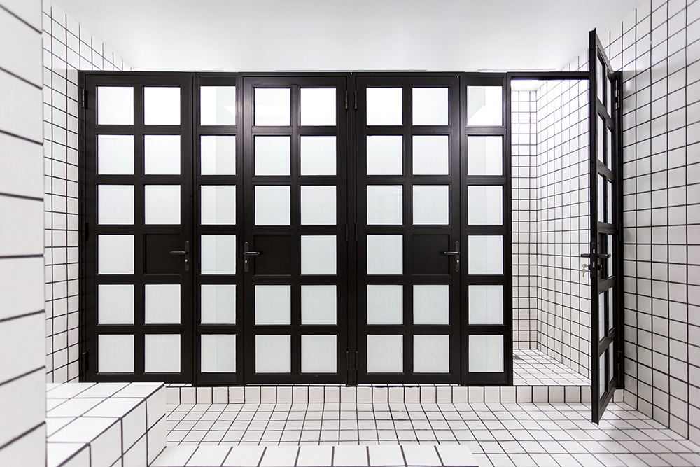
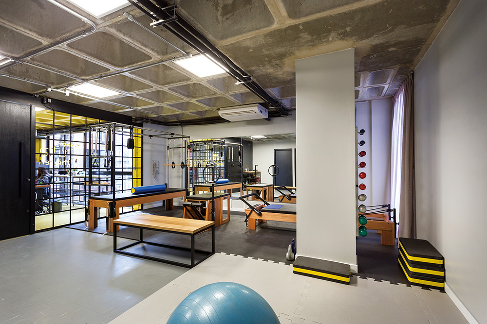
샤워실은 라커룸과는 상반되는 화이트 컬러를 적극 활용했다. 전체적으로 하얀 타일만 사용하면 시각적으로 착시 등의 혼돈이 올 수 있는 것을 고려해, 샤워실 입구에는 바둑판이 연상되는 흑백 컬러의 도어로 작은 변화를 가미했다. 라운지와 라커룸을 지나 더 안으로 들어가면 필라테스와 물리치료를 받을 수 있는 공간이 마련되어 있다. 넓은 여유를 가진 메인 교육 공간과는 다르게, 기구 배치와 필요한 만큼의 공간만을 활용해 효율적으로 꾸몄다. 이처럼 다채로운 공간과 빈티지한 매력을 갖춘 Estudio Pretto는 공간 곳곳의 재미요소로 힘든 훈련 속에서도 회원들에게 즐거움을 제공하는 공간이 되어주고 있다.
Estudio Pretto specializes in Functional training and Sports Conditioning. They hired Arquitetura Nacional to design their new - and much largerspace. Located in the same neighborhood - Moinhos de Vento - the studio now occupies an entire floor of a newly built commercial space, featuring original concrete slab that was kept intact and aparent. The proposal sought maximum visual integration of spaces - as the training requires constant communication between teachers and students. However, compartmentalization of the respective areas was necessary: the reception and lounge area, the locker rooms, warm-up area and training - achieved through changes in the floors designs. The lounge and reception area received a stronger marking: floors, walls and ceiling
were painted yellow. The idea was to create a living space - previously non-existent in the old space - an area where the students can rest and, more importantly, socialize out of training hours. The training area divides in shades of gray and black. The goal is that a student can intuitively understand the spaces the moment he enters the training zone, preparing the mood. The specific floors for each type of practice alternate in space, respecting circulation flows. Ropes in 5 different
colors run throughout the ceiling - starting all together and following the paths of the concrete beams until each one follows it's own course. Main partitions are made of iron frames, with checkerboard shape, remembering old industrial buildings. The use of small tiles and neon lights also bring a vintage mood for the studio. The idea is that it is a timeless space with elements that refer to good things from the past, but with a simple and contemporary language. In this sense, the choice of furniture also had the same objective: the studio can grow healthily, with a strong character that lasts over the many years of future success.
0개의 댓글
댓글 정렬